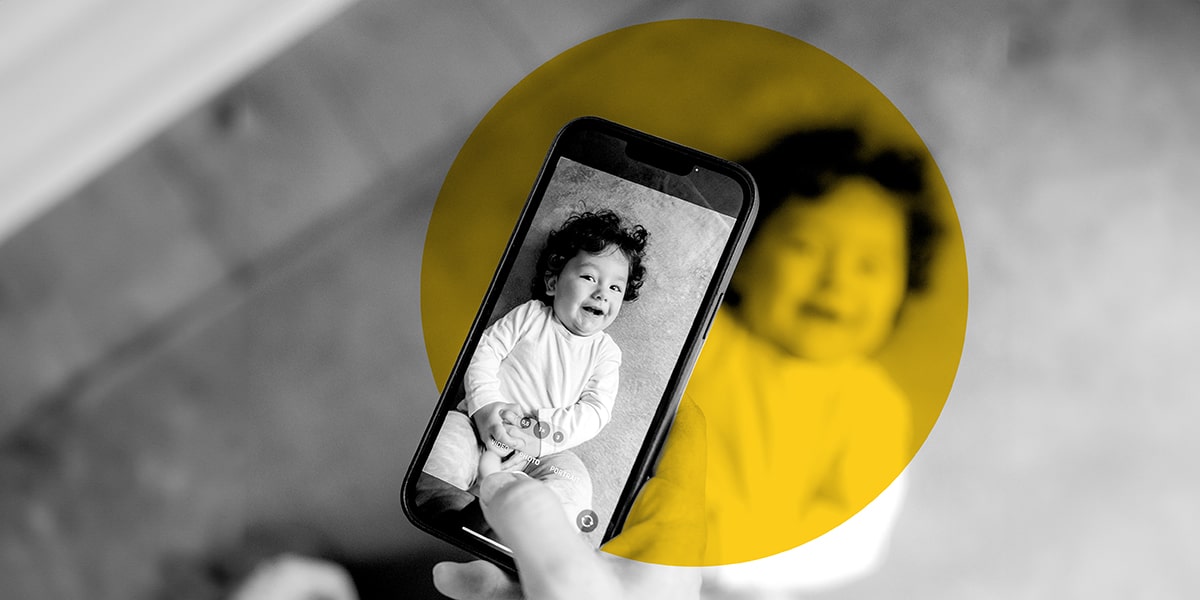
How to Take Good Photos for Marketing Ads With a Smartphone
November 17th, 2022 | 5 min. read
Marketing photography can be nerve-wracking — especially if you're not a pro photographer. How can you get compelling shots that make your people and brand look good?
The anxiety is real! We understand. Here at Zoe Marketing & Communications, we've designed thousands of ads — including plenty with supplied photos. And we're here to assure you that you, too, can take solid marketing photos, all simply using your smartphone.
In this blog, we'll walk you through some of our top tips, including:
-
The right lighting (aka, your superpower)
-
The background
-
What to photograph (people are paramount
-
Directing your subjects
-
Stuff not to sweat
-
Picking your final photos
By the end, you'll feel more confident about taking good photos that help your marketing shine. Yes: Even without a fancy camera or experience.
Download Your Digital Ads Guide
Learn how digital ads can help your business, including the tools, techniques and strategies to create successful campaigns.
The right lighting (aka, your superpower)
Smartphones are all about proper lighting. Luckily, both iPhones and Androids are getting much better at dealing with low light levels. Still, to be safe, good light is huge. Try these tips:
Find a window
Have your subject facing a window so natural light casts onto their face. Don't have the light come from behind them; they'll look dark, and the window will be bright.
No windows or shooting later on? Use the best light you can that doesn't cast shadows. Even with fluorescent light, which can be stark, you can edit and adjust the white balance later.
Forget the flash
Avoid it whenever possible. It tends to wash people out and is unflattering.
Outdoor considerations
First and foremost: Always avoid shooting outside at midday. The sunlight is directly overhead, creating shadows on people's faces. These images turn out poorly.
Instead, photograph outdoors in the first two hours of sunlight — or the last two hours.
And play with the positions people are standing in. Angle them so we can see their faces without the sunlight making them squint.
Sample: A photo with good lighting
Note how the window light spills onto the subject's face.
Sample: A photo with bad lighting
There's a window behind the subject, which makes her face shadowed. Always avoid this.
The background
A clean background is best. When there are people in your photo, they should be the focus. The background is always secondary to the people. A few things to keep in mind:
Avoid banners and signs
It's tempting to want to photograph folks in front of a banner or school sign. Remember: Your designed ad will include your logo. Trying to cram it in a photo with people is distracting. Plus, parts of it often wind up covered or obscured.
Avoid 'busy for no reason'
Sometimes, busy backgrounds are unavoidable — like classrooms and fun kid spaces. That's great; it captures the spirit of where they are. But avoid needlessly busy art on the walls, weird winding staircases, etc. A plain wall (any color) is ideal for portraits. Keep it simple.
Avoid unwanted effects
Is something behind your subject giving them unintentional devil horns? Maybe a tree is sprouting out of their head? Do a quick scan to avoid wonky background consequences.
Sample: A photo with good background
People are busy working on a mural. We can't see all the details but we can figure out what's going on. It's not too busy.
Sample: A photo with a bad background
This is a sample of photographing people in front of a banner. Note we can't read part of it, due to a person standing in front of it. (Plus, there are issues with shadows and sunlight in the eyes.)
What to photograph (people are paramount)
Do your ad photos have to have people? Most often, yes. Even if your facility or offerings are impressive, photos are more compelling with people in them.
Aim for 1-3 people
That means 1-3 people per photo. You want to be close enough to see emotions and expressions on faces. It's also an excellent opportunity to show some diversity.
With 4+ people, they'll start competing with the background. Also, your odds of everyone looking great at the same time shrink.
Remember, you can have one photo with one person, another with a couple, etc. This offers some variety for your ad campaign over time.
A bit of 'b-roll' is OK
Don't totally discount non-people photos. For instance, a fun-looking business space, or a closeup of hands creating something, can be great for "filler" if your ads need it.
All bets are off with kids
If you're photographing children, sometimes you need to go where they are and move where they move. Surrender to the moment. The odds are good you'll get some useable photos.
Sample: A photo with a good amount of people
A classic trio — in this case, a teacher and two kids. A third child is cut off a bit, and that's OK. better to get the main folks in good focus. The background is a bit busy but faded, which is easy to do.
Sample: A photo with too many people
This is an extreme example, but paints the point. We lose people's faces and expressions. The eye doesn't know where to look. On top of it, the lighting casts lots of shadows.
Directing your subjects
That's right: Don't be afraid to direct people. Even if it feels a little awkward, you can do it — and your subjects will feel relieved and more at ease when you're doing it.
Plan in advance
Do a little homework. Pick a room that shows off your facility and has decent lighting so that part is under control.
Don't just accept 'what is'
If someone is in an unflattering position or lighting, reposition them. Remember, you don't have to shoot only candids of what people are doing or accept where they're already standing.
Tell people what to do
Believe it or not, this makes people more comfortable. Perhaps give them a task to do (write on this paper) or thing to hold (a few books, maybe). Get them out of their heads a bit.
Try to be calm and warm
This can be tricky if you're nervous. But people will match your energy. So, take a few deep breaths. If you feel like a novice, own it. Say, "I don't know what I'm doing either. We're all in the same boat! We'll figure it out together." Being honest helps put everyone at ease.
Stuff not to sweat
What about angles, camera settings, orientation or filters? There are so many thing things you could fret over. But we're going bold here and saying: Forget that stuff.
Focus instead on getting a good variety of photos. Get some horizontal, some vertical; some straight-on, some angled. Play with it! Digital gives you the freedom to snap a lot of pictures. You can go back later and see what worked and what didn't.
Our top tip here: Don't over-science it. Some pictures are always better than no pictures at all. Don't stop because you "didn't do it right." And remember, you'll only get better.
Picking your final photos
You've got a digital heap of photos. Now what? This part can feel overwhelming, too. But, especially if you're sending options to an agency, you'll want to whittle them down. Try these steps:
-
Run through them yourself. Look with a "broad eye." Is the lighting good? No one blinking? Angles roughly flattering? Then, edit hard — down to your favorite dozen or so.
-
Check with key people on your team for input. What impressions do they have? Different perspectives help, but don't let them drag you down. It can help to tell these folks you're asking for their feedback, which you will use to make a final choice.
-
Send your final "top picks" to your design team or agency.
What are my next steps to creating compelling ads?
Taking great marketing photos can feel stressful at first. But, as you learned in this blog, a few key factors and a little planning go a long way.
Our top takeaways: Good lighting is essential (always natural over flash), backgrounds should be clean, and people are the most compelling subjects. Plus, don't be afraid to direct (people crave it). Finally, get a good variety of shots and don't over-science it.
Ready to take your ad design to the next level? Talk to your advisor at Zoe Marketing & Communications. We'll put our 35+ years of ad creation experience to work for you.
Looking for more insight on making amazing ads? These articles are the ticket:
Download Your Digital Ads Guide
Learn how digital ads can help your business, including the tools, techniques and strategies to create successful campaigns.
Lauren Jeziorski brings 15+ years of creativity to her role as photographer, videographer and graphic designer for Zoe Marketing & Communications and its sister companies, Metro Parent and Chicago Parent. She loves making visual products that radiate energy.
Topics: