«  View All Posts

Why Good Images are Important for Ads — And How to Make Yours Better

November 15th, 2022 | 5 min. read

By Lindsey Lawson

Discover 4 key types of Digital Ads for your business with the free guide.
Download
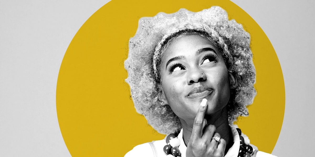
Woman looks up to the left with her index finger on her chin in a thinking face
 

Quick question: Did you ignore the image at the top when you started scanning this blog? The odds are slim. Clear, clean images grab our eyes and our attention.

That's why they're essential for branding your business. After all, 67% of consumers say good images of products or services are "very important" when choosing that product or service, according to MDG Advertising.

But what images will best represent you? Here at Zoe Marketing & Communications, we've helped hundreds of clients find vibrant, compelling images to do just that. And yes: This includes using so-called "stock" photography — an excellent tool that can get a bad rap.

In this blog, we'll walk you through the essentials of great images, including:

  • The power of photos in provoking emotions

  • The basics of photo sizing and resolution

  • Examples of good and bad pictures in ads

  • Tips for snapping original photos

  • Why stock art is powerful, authentic and nothing to fear

You'll walk away with a clear understanding of why good photos are essential for your ads. And, of course, you'll discover how you can improve yours.

FREE GUIDE

Download Your Digital Ads Guide

Learn how digital ads can help your business, including the tools, techniques and strategies to create successful campaigns.

The power of photos in provoking emotions

Good images tell a story or stir an emotion that catches the viewer and draws them in. Yes, the words are essential. But the image is often the first thing that grabs the reader's eye — and can speak that proverbial "1,000 words."

The images you choose should be relatable — and prompt curiosity and feelings, such as:

  • A sense of excitement: "Oh, that looks fun. I want to do that!"

  • A sense of welcome: "This feels accessible and open to me."

  • A sense of warmth and calm: "I already feel at ease about this."

  • A sense of intrigue: "I wonder what that's about. It looks interesting."

  • A sense of comfort and security: "This looks like a safe place to send my child."

It's also vital to select photos that show your business at its best. Here are a few common examples of services we see here at Zoe:

  • Schools: Kids are happy, engaged and look like they're having fun

  • Health care: People are healthy and enjoying themselves; a doctor appears to be kind, patient and welcoming

  • Shows/activities: Attendees are having a great time in enticing settings; snapshots of shows are colorful and engaging

  • Camps: Children look like they're having a blast in a safe setting

  • Preschools: Kids appear to be safe, happy and well taken care of

  • Special needs therapies: Compassionate therapists are helping children thrive

Think of how you want your viewer to feel. Choose photos that capture that.

The basics of photo sizing and resolution

Photos lose their magic fast if they're blurry. But that's what happens when an image's resolution — i.e., how much visual detail it has — is too low.

The correct resolution for web

Digital ads images need a resolution of 72 PPI. That stands for "pixels per inch." If it's lower than that, remember that if you try to make the image bigger, it'll look pixelated or stretched out.

Since web ads are generally small, most 72 PPI images will be usable. However: If you take a screenshot of a small image on your website — say, 1" x1" — know that it can't run any larger than that. Again, it'll lose quality.

And if the image is too big or very high in resolution? You'll need to optimize for web use with your design software — or your marketing agency can do this for you.

The correct resolution for print

Print ad images must be 300 DPI, or "dots per inch." In this case, the resolution and size matter.

Say you have a 300 DPI image that's only 4" x6". That's the largest size it can run without losing quality. So, for a magazine, that might be fine for a quarter-page ad — but not a full page.

If the image is "low-resolution," don't use it for print because it will be pixelated. 

Examples of good and bad images in ads

The best photos are clear and engaging. So, let's take a look at a couple of examples.

Good and bad print ads


Good Stock Art Example

1. Good example

This little girl is in a colorful classroom. She's focused on her learning with a genuine smile on her face. As viewers, we sense she's supported, happy and having fun. The invitation to "Join Our School!" feels authentic and pairs well with the image.


2. Bad example

While this photo is also colorful, one boy's expression is morose; the other is downright miserable. Here, the invitation to "Join Our School!" feels unwelcome. These kids don't seem to be enjoying themselves. Plus, the image is poorly lit.

Good and bad supplied photos

Here are examples of supplied photos that Zoe has received from clients. That means the client took the image themselves.

Good Supplied Art Example

1. Good example

This teen looks genuinely focused on his studies. Natural light is spilling on him from a window (but not washing him out). The photo is clear and crisp.

Bad Supplied Art Example

2. Bad example

The biggest issue is we can't see this young girl's face. Our eye goes to her work which is a bit hard to see, too. The lighting is good, but we lose out on any emotion. Again, the lighting is also poor.

Tips for snapping original photos

Ideally, it's great to have images of your actual products, services or clients.

Professional photography

If it's within your budget, a professional photographer is beneficial. Consider:

  • Hiring someone for a period of time — whether a few hours, a day or a week — to capture some key moments and people.

  • Photographing actual clients/students/patients/etc., if possible. Secure permission in advance, especially if involving children.

  • Photographing your staff interacting with clients.

  • Getting a variety of shots — different settings, people, angles, etc.

Do-it-yourself photography

We'll assume you're using your smartphone, which is a very common and high-quality tool. Our top tips here:

  • People are compelling. Aim to capture at least some; clients (with permission), staff, etc.

  • Aim to photograph only 1-3 people at once. Close-ups are ideal. You want to see their expressions. With bigger groups, you lose detail.

  • Be mindful of the lighting. If people can face a window, that natural light can be helpful. Try to avoid using flash or creating harsh shadows, especially on faces.

  • Try to keep your background clean and simple when possible.

  • It's best to stick with regular camera mode. "Portrait" mode blurs out the background. That can look more stylized, but you can always edit in that effect later.

  • Take more than one option of the same photo — some closer-up and some with more background. Remember, sometimes words go on the background of an image in an ad. Extra space gives more flexibility in designing the ads.

Why stock art is powerful, authentic and nothing to fear

Finally: Let's talk stock images. "Stock" refers to pre-taken photos that, thanks to licensing fees, are available for re-use in online libraries like Shutterstock, iStock and Adobe Stock.

People often worry that stock will look staged, fake, forced or not genuine. Fortunately, with high-quality stock libraries, that is not the case. Instead:

  • Paid stock images are high-quality photos taken by professional photographers. They use great lighting and natural-looking subjects.

  • With millions of photos at your fingertips, you can often find an image of precisely what you want. That includes generic photos that look like they came from your business. (Exceptions might include school-specific uniforms, etc.)

  • Stock photos are "high res." So, they're often large enough to use zoomed-in or for full-page ads.

  • Stock photos factor in design specs. Photographers often leave extra space that's perfect for headlines and other words.

Bonus: If you're working with a marketing agency, many have paid subscriptions to stock libraries. They'll help you select and edit photos at little or no extra cost.

What are my next steps for getting or creating good images for my ads?

Good images are essential for compelling ads. They definitely shouldn't be an afterthought.

In this article, you learned how images can stir emotions. We covered sizing and resolution. We gave you tips on shooting better photos with your smartphone. And, finally, we explained why high-quality stock art is impactful — and sometimes better than supplied photos.

Ready to use good photos to create some great ads? Talk to your advisor at Zoe Marketing & Communications. We'll pull from our extensive ad design experience to help yours drive results.

Looking for more guidance? These articles are the perfect next step to keep learning:

DigitalAds-cover-1
FREE GUIDE

Download Your Digital Ads Guide

Learn how digital ads can help your business, including the tools, techniques and strategies to create successful campaigns.

Lindsey Lawson

Senior graphic designer Lindsey Lawson brings 12+ years of experience to her role at Zoe Marketing & Communications. She’s well-versed in creating marketing campaigns, magazine layouts, brand identity and web pages that catch busy people’s attention.