
«  View All Posts

How to Create Successful Digital Ads That Drive Conversions

August 3rd, 2022 | 6 min. read

By Kelly Buren

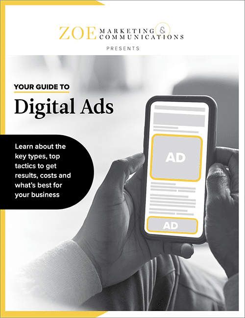
Discover 4 key types of Digital Ads for your business with the free guide.
Download
 

The battle for eyeballs is real — and intense — with digital ads. After all, only about 0.25% to 2% of people click on paid digital ads they encounter online.

There's plenty of competition for that attention, too. In all reality, you have seconds to grab someone's attention and hope they click.

If it all feels overwhelming or frustrating, you're not alone! But we're here to tell you that even though web advertising can seem like a low-impact investment, it's actually a successful and savvy marketing tool. And you can boost your odds with high-impact ads.

Zoe Marketing & Communications runs hundreds of ad campaigns each year. We're experts at creating quality ads that give the best possible chance of clicks and conversions. We also know how to optimize your ad-designing time and effort for a higher ROI, or return on investment.

In this blog, we'll walk you through five of the most critical factors, including:

  • Why a clear focus and well-coordinated landing page is essential

  • Which three ad sizes you should focus on

  • The "anatomy" of words in digital ads (and how to pack a punch with yours)

  • Using visuals like images, logos and color to create a potent ad

  • How often you should shake up your ads to avoid "ad blindness"

By the end of this post, you'll have the confidence to start creating digital ads that move the needle like a pro — or know what to ask for when reaching out to a marketing firm.

FREE GUIDE

Download Your Digital Ads Guide

Learn how digital ads can help your business, including the tools, techniques and strategies to create successful campaigns.

1. Why a clear focus and well-coordinated landing page is essential

First, give your ad a singular, simple focus. You only get those few seconds to convey information. The clearer your ad, the more likely people will see it, grasp its meaning and take action within that tiny timeframe.

Before anything else, hone in on these two factors:

Choose a clear goal for your campaign

Are you going for brand awareness? Boosting your website traffic? Getting folks to register for a newsletter or event? Buy tickets? Be crystal clear on what you want people to do.

Link to a landing page that gets the job done

The whole point of your ad is to drive people to a URL. So pick a page with the best, most direct answer to whatever you're asking them to do.

If that's signing up for an event, link to a ticket sale page, for example. The fewer times a person has to click, the higher the odds they'll take that action.

2. Which three ad sizes you should focus on

Did you know that Google Ads offers about 40 different ad sizes? Sure, you could create ads for all of them. But that's a lot of wasted time and energy designing ads.

Instead, we turn to Google Ads' top performers for a flavor of what performs best. These tend to have the most ad "inventory," meaning more websites across the internet support these ad sizes. So they have the highest number of places they could be "served" to.

At Zoe, we've whittled these down to a list of the "top three":

Adsizes

300x250 pixels

This ad is often called a "tile" or "medium rectangle." It usually appears in a left or right sidebar, or in the text of an article (aka "inline"). It's used on desktop or mobile views.

Adsizes2

728x90 pixels

Desktop only. If you are viewing this from your phone, the image will not be true to size.

Also known as a "leaderboard," this classic banner-type ad appears at the top of a page or in-between articles. It's used for desktop views.

Adsizes3-2

320x50 pixels

Called a "mobile leaderboard," this mobile-only option is used in the same places as a 300x250 ad, or at the bottom of a mobile screen.

Runners up

While the "top three" is all you need, you can also mix in one of these contenders:

  • 300x600 pixels: Used in a sidebar on desktop or inline for a mobile screen.

  • 320x100 pixels: It's interchangeable with the mobile/desktop-friendly 320x50. Although it's larger, it has less inventory available.

  • 336x280 pixels: This "large rectangle" performs well, too. It's always in a sidebar. Desktop only.

3. The 'anatomy' of words in digital ads (and how to pack a punch with yours)

Ah, the critical "ask." So, what language and text work best in digital ads? Let's break it down.

AdAnatomy

Three key parts 

What text is in an ad? Always these three things, in order of importance:

  1. Value proposition. What are you offering? What makes you different? Why should someone click? It's the most crucial information on the ad — where your eye should go first. It's the thing that will get people to click on your ad. 

  2. Call to action (aka CTA). This is the action you want people to take. Be sure it creates a sense of urgency: "Click here," "Learn more," "Buy now," etc. 

  3. Description. Only if you need it to add some clarity to the value prop, and only if you've got room for it. Typically, leave it off. (You won't have space for it on smaller ad sizes.)

What works best with words

When "wording" in an ad, aim for simple and punchy prose. A few tips:

  • Focus on feelings. Some words trigger emotions ("incredible," "amazing," "free"). Others spark curiosity ("How do I ...?"). Others still raise their expectations ("best," "top tips"). Use strong words that promise solutions to improve your odds of clicks.

  • Be clear. Would you click on an ad that said, "Now offering 40% off" — but didn't say what's being discounted? Don't leave people guessing or confused.

  • Avoid jargon! For instance, a school might offer "social-emotional well-being" education. That's a lot of words. And most people don't know what it means.

  • Don't exceed 3 lines of text. Keep it breathable and easy to read quickly.

  • Keep your message consistent in all ad sizes. No need to mix it up, unless you need to trim for space in smaller ads.

  • Bigger ad sizes do NOT mean more text. You still have the same amount of time to convince somebody. You want people to grasp your message immediately.

Keep in mind: These are best practices. But it doesn't mean you won't have a successful campaign if you don't follow them. Some break the rules and still do well.

4. Using visuals like images, logos and color to create a potent ad

Words aren't the only thing grabbing their eye. Harness your ads' aesthetics to up the ante.

Match your ad to your landing page

Remember, this landing page is the entire point of the ad. The ad design and the landing page should resemble/reflect each other so readers instinctively know they've made it to the right place. If not, they'll get confused and abandon ship, fast, unlikely to return.

You've already built trust with the ad, and now, readers know they're in the right place — which eliminates another barrier.

To do this, ensure the landing page and ad follow your brand guidelines, using the same color scheme and fonts.

What works best with images

Art is powerful. Turn their heads, in a good way, by keeping these top tips in mind. 

  • Consider your logo, first. This is crucial to building your brand. If it's a complex logo that's harder to read in the ads, use your business' name, instead, in clear font.

  • Make any image relevant. Make sure it captures what you're promoting.

  • Simple is best. Use one single image, not a collage. Avoid anything too complex. 

  • Don't overlay! Don't put your logo or text on top of an image. It's harder to read. Again, the simpler the image, the easier it is to avoid that.

  • Fonts and colors are "art," too. Strong, bold choices can nix the need for an image.

  • Frame your ad. People focus on things that are in boxes. Avoid a "floating edge" with an outline — especially if it's an ad with a white background.

  • Keep image/gif sizes low. Whether a static ad or moving, aim for 1MB or smaller. Plus, keep gifs only a couple seconds, so people will see them in full as they scroll.

Some good design examples

These ads show a singular focus, a clear value proposition and a catchy CTA. They are easy to read, with text on solid backgrounds and imagery that complements the value proposition — or, in the case of fiverr, no image is necessary.

1cd638eae058e67bc87526188345bab14c99ca9d7d77148873192441888e5ab6457f01aed1c02d4e91cd000cbe4b686905447cae9e8a6d0c44561821814b8aeb

Some poor design examples

These ads are crowded with too much or irrelevant information (like a full address, phone number or URL), too many images or logos, and not enough room for the eye to rest.

PoorDesignExamples

All ad examples were provided by Moat.com — a useful tool for digital ad design inspiration.

5. How often you should shake up your ads to avoid 'ad blindness'

Ads are a tricky balancing act. Repetition is important: People often need to see your ad multiple times before they click. But once it hits a certain threshold, they'll start to ignore you. It's sort of like how your brain ignores the nose on your face. You can always see your nose, but your brain starts to tune it out.

To sidestep "ad blindness," plan to update your ad campaign every 30-45 days. It can be the same goal, but switch up your value proposition and imagery. Your CTA can remain the same. Keep your color scheme consistent, too, to bolster brand awareness.

What are my next steps to get my digital ad campaign going?

Digital ads don't have to be so confounding! We've given you five key clues to keeping your campaigns potent driving conversions.

Before all else, have a clear focus and well-aligned landing page. Next, focus your design efforts on the top three sizes (that's 728x90, 300x250 and 320x100 pixels). Then, hone in on strong text with a compelling value proposition and call to action.

From there, keep your visuals clean and consistent. And finally, be sure you're shaking up your text and imagery every 30-45 days.

Need a little boost? Zoe can help you determine your ad campaign's best focus, messaging and aesthetics. Reach out to us for a consultation. Or, if you're still learning and weighing your options, discover what types of marketing products work best in the buyer's journey.

Sure, digital ads are a fleeting window to grab attention. But they work! And with a strategic approach and a little clarity, you'll be well on your way to driving up your conversions.

DigitalAds-cover-1
FREE GUIDE

Download Your Digital Ads Guide

Learn how digital ads can help your business, including the tools, techniques and strategies to create successful campaigns.

Kelly Buren

Beyond serving as Zoe Marketing & Communications’ creative director, Kelly Buren has sharp marketing instincts. Whether designing a magazine or compelling ads for clients, in her 15 years in the field, she’s learned to take risks and test, test, test.