December 13th, 2022 | 5 min. read
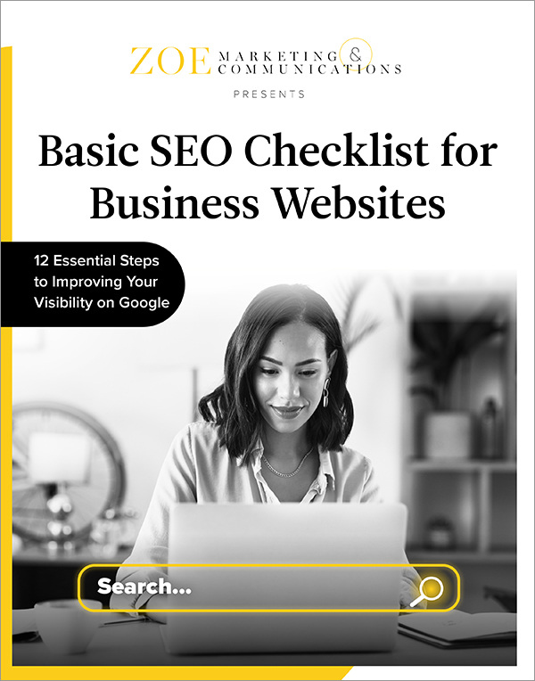
Download Your Basic SEO Checklist
Unlock the fundamentals of search engine optimization. This checklist provides step-by-step guidance to improve your site’s search ranking.
December 13th, 2022 | 5 min. read
When you have a landing page, the goal is simple: Get people to take action on it. It could be filling out a form or clicking a button (or both). But in reality, most people "bounce."
It's typical to see bounce rates hit 70-90%, according to digital marketing resource QuickSprout. That can feel frustrating when you're trying to increase your conversions.
At Zoe Marketing & Communications, we understand this challenge. In our 15+ years of digital marketing, we've helped clients improve their landing pages — and the ads sending folks there.
In this blog, we'll reveal some bounce basics. Then we'll detail some top solutions, including:
Fixing mismatches between your ads and landing pages
Testing out (and shaking up) your ads
Checking your website's load time and mobile compatibility
Assessing your page's copy
Keeping your form simple
Having one clear, clutter-free "call to action"
Reevaluating who you're targeting
By the end, you'll have a more realistic sense of how landing page bounce rates work. And you'll walk away with actionable steps to decrease those rates.
Unlock the fundamentals of search engine optimization. This checklist provides step-by-step guidance to improve your site’s search ranking.
A bounce is when someone makes it to your landing page — often via a digital ad or email — and leaves that page without filling in a form or taking some specific action.
It's worth repeating: 70-90% of people bounce from a landing page. This is simply the nature of how we act on the web. We may accidentally click an ad that links to the page, then "bail out." We could be curious, then lose interest or feel unprepared to commit.
It's also worth noting there are three types of bounces. Each provides good insight:
Hard bounces: Folks who arrive on your page but exit almost instantly. They may have clicked by mistake or changed their minds. But they're not interested.
Medium bounces: Those who arrive and stick around for a few seconds. They may scroll a bit or click something on the page. But they aren't swayed.
Soft bounces: These visitors stay more than a few seconds; even minutes. They don't convert, but they're intrigued — and they're the best group to retarget with more ads.
While it's impossible to eradicate bounces, there are steps you can take to improve your number of soft bounces and, of course, conversions. Here are some great starters.
Make sure the thing that gets people's attention — typically, an ad — aligns with your landing page. You want people to feel like they've arrived in the right place after clicking your ad.
Color scheme and design: Make sure both are complementary. If your ad uses bold colors, but your site is more subdued, it could feel off and confusing.
Messaging: Make sure this matches up, too. If your ad promises a fantastic free download, don't send people to a generic page to hunt for it. That's frustrating.
Effective ads that drive fewer landing page bounces take trial and error. We often have a sense of what resonates with people — but people can surprise us. See what's working by:
Doing A-B testing: Run two versions ("A" and "B") of your ads at the same time and assess which works better. One to two weeks is a best-practice time span to test.
Changing 'creative': People can get "tunnel vision" and tune out your ads. Shake up your ad's image (or video) every 60-90 days. The message can often stay the same.
This is critical. If your web page takes too long to load, you're far more likely to lose people — including some of those hard bounces. The page-loading benchmark is 0-3 seconds.
Wondering what your speed is? For the average, log into your Google Analytics. In the left column, under "Behavior," select "Site Speed" and then "Overview." For a deeper look, explore free tools like SpeedLab, PageSpeed Insights or Pingdom.
Plus, it's basic, but: Is your site mobile-friendly? Most folks search on their phones. They're more likely to leave if you're making them pinch and zoom. Another common mistake: Your site is mobile-friendly, but your form isn't. Don't lose them at this critical point!
What do the words say when people get to your page? It's a balancing act. If your ad enticed them to get something, the form they need to fill out to get it must be easy to find. But they also may need to learn more about you before they feel comfortable giving away their info.
At the very least, your landing page should have the following:
A clear, compact header and subheader: They'll see this first. Be direct about what you're offering and why it's valuable.
Some friendliness and trust-building: Give a better sense of who you are. The length of this "body copy" can vary. A free download often takes less. If you're direct selling something or asking for people's info to connect, it can take more educating. Test it out.
A prominent call to action. Make sure the form fill is easy to find. If you have a lot of words on the page, place that "CTA" within the copy at a few points.
Is your form asking people to give too much info? That could be boosting your soft bounces. Whenever possible, ask for a first name, last name and email — and that's it.
Usually, the more you ask of people in a form, the less likely they are to fill it. This is often your "gateway" — your chance to get folks' info and start a conversion via email.
People are far less likely to give phone numbers. And if you do need a bit more info — say you're a tutor with excellent content to share based on a child's grade level — it might be worth the extra ask. Just know you'll lose some people in the process.
Again, an obvious call to action on your landing page is essential. Make sure it gets noticed. That also means cutting out as many distractions as possible, so:
No ads: Omit them, whether they're focused on you or clients.
No links: Don't take people away to other pages or blogs.
No navigation bar: The menus at the top of your pages can be distracting. Remove them, especially if they're busy.
No widgets: Don't tout your newsletter sign-up, for example. Keep margins clear.
Sometimes people will "bounce" from your landing page to other pages on your site. While that's good for your site traffic, it may also deter them from that coveted form you'd like them to fill.
Are you targeting the wrong people? It's possible! In your ad campaigns, check the demographics and interests of your target audiences. Or, if you're using search engine marketing, reevaluate the keywords you're going after.
For example, if you're a private school, you may be targeting the right geographic area, but not the correct household income. Or perhaps what you're offering just isn't grabbing people.
Make sure you understand your potential audience and align with them.
Landing page bounces are a fact of life, but you can make your pages more "sticky."
In this blog, we touched on the basics of bounces, including hard, medium and soft (the most promising type). We also covered seven steps to getting people to stay on your landing page longer — and, ideally, fill out your form in the process.
Looking for more guidance with your landing pages and ads that get people there? Talk to your advisor at Zoe Marketing & Communications. With our extensive digital marketing and audience experience, we can help you improve your landing page and align it with your ads.
Or, to learn even more about improving your conversion rates on your own, be sure to read:
Unlock the fundamentals of search engine optimization. This checklist provides step-by-step guidance to improve your site’s search ranking.
For 17 years, Julia Elliott crafted strategies and stories for Zoe, along with its sister companies, Metro Parent and Chicago Parent. A deep background in journalism helped her create customized content marketing to drive client success.