Imagine visiting a trampoline center after seeing an exciting ad. You arrive and push open the doors — only to walk into a plain office space with a formally dressed receptionist.
“Um,” you might say. “Am I in the right place?”
That’s what happens when your well-designed ad or email and landing page don’t match up. The result? People leave.
At Zoe Marketing & Communications, we’ve helped businesses create high-converting landing pages since 2020. Here’s how to make yours work.
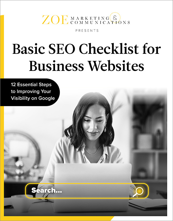
FREE GUIDE
Download Your Basic SEO Checklist
Unlock the fundamentals of search engine optimization. This checklist provides step-by-step guidance to improve your site’s search ranking.
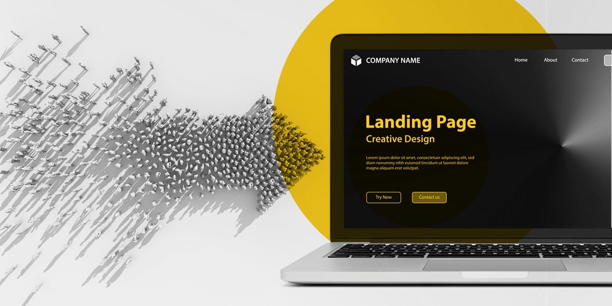
5 ways to ensure your ads and emails lead to good landing pages
1. Match your ad’s message and design
If your ad is bold and colorful, but your landing page is dull and minimal, visitors will hesitate. Keep things consistent:
- Color scheme: Match your ad’s branding. No jarring changes. If your ad uses dayglo orange but clicks to a subdued, monochromatic page, it can feel “off.”
- Message: If your ad says “Sign up for our free event,” your landing page should feature that event — not, for instance, your general homepage.
A seamless transition builds trust and engagement.
2. Make your value proposition and call-to-action clear
Your landing page must answer: Why should they care? What’s in it for them? Keep it simple:
- A strong header and subheader: Clearly state your offer and its benefits.
- A short, friendly intro: Reassure visitors they’re in the right place.
- A prominent call to action (CTA): Spell out exactly what they need to do. (Example: “Enter your email for a free guide.”)
3. Keep it distraction-free
On your landing page, visitors should only focus on your offer. Avoid:
- Ads: Even if they promote you, they’re distracting.
- Links: Don’t tempt visitors to leave for other pages.
- Widgets: No extra sign-ups or pop-ups.
Instead, keep their eyes on the prize — your CTA.
4. Simplify your form and ‘warm up’ visitors first
People hesitate to give personal info. Ease them in:
- Ask for essentials only: Typically just the name and email should be required fields.
- Avoid phone numbers: They lower form completion rates.
- No deep personal details: Keep trust-building gradual — skip the age, address, etc. at this point.
Lead into the ask, too. Don’t hit visitors with a form immediately. Use that short, warm intro before prompting them to act.
5. Tailor landing pages for different ad sources
Not all visitors are the same. Optimize landing pages based on where they came from:
- Search ads (Google Ads) → More detailed info. Searchers want solutions. Provide clear answers and benefits.
- Social media ads → Short and snappy. These visitors weren’t actively searching, so keep it concise.
- Retargeting ads → More familiarity. They already know you, so focus on reminders and urgency.
Next steps for building better landing pages
A well-crafted landing page converts ad clicks into action:
- Match design and messaging for a seamless experience.
- Clarify value and CTA — no confusion.
- Remove distractions to keep visitors focused.
- Simplify forms and ease into the ask.
- Tailor pages for different ad sources.
Need expert guidance? Talk to us at Zoe Marketing & Communications. We help businesses refine ads and landing pages for better conversions.
Want more insights? Discover:
Kim Kovelle
As Zoe Marketing & Communications’ content manager, Kim Kovelle brings over 20 years of writing and editing experience in metro Detroit. She has strong roots in community journalism and a knack for making complicated topics make more sense.
