«  View All Posts

The 11 Best Features of a Good Website (+ 1 Bonus)

February 14th, 2023 | 6 min. read

By Kim Kovelle

Build your website’s visibility with the free Basic SEO Checklist.
Download


It's an understatement to say people judge your website in a blink of an eye. It's actually about 7 times faster than that. Specifically, Canadian researchers found, it takes 0.05 seconds.

This wild stat underscores why having a "good" website is essential. Whether your business' site is on sturdy ground or you need help to evolve, luckily, there are clear actions you can take.

So what are the best features of a good website? Zoe Marketing & Communications has some answers, based on our 16+ years in the digital space. In this blog, we'll cover 12 of them:

  1. A simple platform

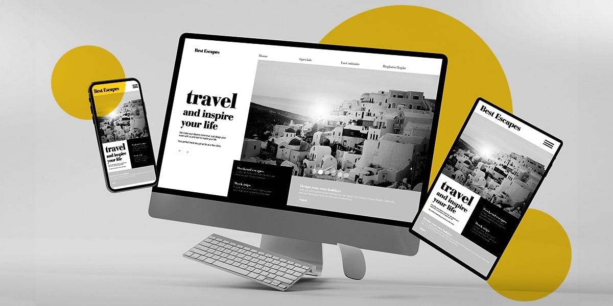
  2. Mobile-first design

  3. Quick page load time

  4. A solid, understandable "about us" page

  5. Strong brand identity throughout

  6. Clear contact information

  7. Clean, "skimmable" content

  8. Powerful landing pages

  9. Great CTAs (calls to action)

  10. Good SEO practices

  11. Security mindfulness

  12. Bonus: educational content 

You'll soon have a list of action items to start improving your site. You'll feel more educated and empowered to take the next steps — whether it's by yourself, or with a web development expert.

FREE GUIDE

Download Your Basic SEO Checklist

Unlock the fundamentals of search engine optimization. This checklist provides step-by-step guidance to improve your site’s search ranking.
1. A simple platform

Be sure it's easy to control your website based on the staff you have. Many companies opt to work with a web developer, which helps with big-picture strategy. But if you need to make small changes or updates, you want some nimbleness.

Start by picking a CMS — aka content management system — that best meets your needs. WordPress is one of the heaviest hitters, which runs 43% of all websites. For a little more dexterity, a "plug and play" format like Wix or Squarespace has fewer bells and whistles.

Whatever you pick, make sure you won't get bogged in needing to know a lot of coding, for instance. And be sure your CMS (and web dev) both offer you good support.

2. Mobile-first design

At least 60% of all website traffic comes from mobile devices. This means "mobile-first" design is a proactive, important move. People don't want to "pinch and spread" to see what's on your site. That happened with the old-school "responsive" design, which was tailored for desktops.

Fortunately, now, mobile-first is baked into CMS options. It simplifies your site with things like:

  • An accordion-style (aka "pancake") navigation menu

  • Bigger clickable buttons and hyperlinks

  • More breathing space for content

  • Larger font size (at least 16 pixels for body copy)

3. Quick page load time

If folks form an opinion of your site in 0.05 seconds, it stands to reason your pages need to load fast. Google says about 2 seconds is the max, though it aims for 0.5 seconds. Other sources nudge that number up to 3 or 4 seconds. But the closer to 0 seconds, the better.

In fact, in 2010, Google added site loading speed to its ranking factors. So, the quicker your site loads (and delivers great content, of course), the higher it appears in search results.

4. A solid, understandable 'about us' page

This seems so simple, but it's huge. After your homepage, this is one of the most clicked-on pages. Why? However people got to you, if they're curious, they want to know more — whether they're prospects or potential employees. 

Making yourself approachable and customer-focused is essential. A few key ideas:

  • Use more "you" language than "we" language.

  • Focus on how you can help people.

  • Avoid buzzwords and jargon.* Speak directly to people.

  • If possible, it's great to include photos of staff and mini bios.

  • Consider adding a powerful testimonial or two.

  • Have a clear call to action.

*For a fun way to avoid "icky" language, check out "About Page Crappy Copy Bingo" from web consultant Gill Andrews. Spoiler: scrap words like "ultimate," "success" and "award-winning."

5. Strong brand identity throughout

This has several layers. At its most basic, your brand identity includes your color scheme and design layout. Keep it clean, simple and easy to navigate. Other factors to consider:

  • Font choices (again, simple and clean are best)

  • Images (are they stylized? photos vs. illustrations?)

  • Your tone of voice and message (is it playful? conservative? casual? formal?)

Think about your values — and how you want people to feel about you. Ensure your brand identity is consistent, accessible to your target audience and, most of all, true to you.

6. Clear contact information

This doesn't only apply to your contact page — but that's crucial. Think of other key pages where people might want to "convert" or supply their email to connect, and include details there, too.

Some essential contact elements include:

  • A form: This is critical. It should appear on your contact page and any "calls to action" (aka CTAs) on other pages. Keep it simple: ask for a first name, last name and email.

  • Phone number: Depending on your business, make this easy to find on the contact page. Feature your operating hours, too, and even response time, if applicable.

  • Address and map: Again, this depends on your business. But make it clear, especially if you're a local destination.

  • Social media: This is a big validator, and folks often seek out and follow brands they're intrigued by and trust. Include the logos and links to these in your site header or footer.

Again, make it simple to find and access.

7. Clean, 'skimmable' content

Skip the buzzwords, jargon and run-on sentences. Make your copy digestible and engaging, and separate it into chunks that people can easily "skim" and understand. In other words:

  • Use headers (H1, H2, etc.)

  • Make paragraphs short (even one sentence, sometimes).

  • Pepper in poignant images.

  • Make it really easy to find the answers they're looking for.

  • PLUS: Ensure your pages are up-to-date and your copy is clean. No typos or moldy info.

This applies to your home page, about page, case studies page, service description pages — you name it. Make it a breeze to get to know you fast.

8. Powerful landing pages

If you have any page asking people to give you their information, give it extra attention. Particularly if you're promoting this page with paid marketing like digital ads or emails.

What makes a good landing page? These are a few core things to consider:

  • Keep the page focused and distraction-free (no ads, off-page links, etc.)

  • Have a clear value proposition — what are you offering, and why is it valuable?

  • Warm people up before asking for their info (be friendly and build a little trust)

  • Make sure your page's message and design match with any digital ads promoting it

9. Great CTAs (calls to action)

These should appear in various posts and pages throughout your website. A classic example is a button encouraging people to click to claim an offer.

Why? People may want to learn more about you or something you offer at any given point. Your site should make it effortless for them to engage with you more, whether it's a link to a free download, a sign-up for an enewsletter or a way to connect.

10. Good SEO practices

You want people who are Googling for your products or services to find you. That requires some old-fashioned search-engine optimization, better known as SEO

Be mindful of SEO best practices. For instance:

  • Tighten up your "technical SEO," ensuring that search engines can index your site.

  • Each page and post should have clear titles and meta descriptions.

  • Optimize your content for targeted keywords.

  • Ensure you have a quality user experience and load speed (see #3).

  • Optimize your page titles, URLs, descriptions and snippets.

Google has more than 200 factors it considers in SEO. That said, it's helpful to focus on doing the essentials well. Over time, they'll help you earn that traffic.

11. Security mindfulness

It's deeper on the list, but it's imperative. Two musts:

  • Add HTTPS to your URL. Short for "Hypertext Transfer Protocol Secure," it makes your site secure. This protects any personal info people provide.

  • Get an SSL Certificate. A "Secure Sockets Layer" encrypts users' info as it's transferred from your website to your database.

Of course, you'll also want a secure web host and payment/credit card system (if using one). Plus, on any page where you're gathering an email, be sure to note that you're keeping people's data and privacy secure.

12. Bonus: educational content

Again, clean, "skimmable" content is essential on all your pages. But to take it to the next level, consider content marketing. In other words: Blog about topics you're an expert in.

This elevates your expertise, authoritativeness and trustworthiness (i.e., "EAT") in Google's eyes. But you'll want to make sure these stories are substantial and sustainable. Consider:

  • Length is important. A 900-word article tends to be better than 300, for example. But always focus on answering people's questions first. If you can do that in fewer words, that's fine. Don't just fill space to meet a quota.

  • Quality is paramount. Provide great information that helps people.

  • Consistency matters. Make sure your stories are substantial and sustainable. Google wants to see a regular cadence (aim for at least once a week).

This tactic helps your credibility, but it needs infrastructure. If you commit, commit fully.

What are my next steps to creating a good website?

A good website needs a mix of solid technical considerations, security, design and content. From a manageable platform to fast load times, this blog tackles some of the top things you'll want to consider for your business' site.

Are you looking for additional guidance? Talk to us here at Zoe Marketing & Communications. We've been in digital marketing for 16+ years and would love to help you level up your site.

Still doing your research? Keep at it! And, in particular, we recommend focusing on improving your landing pages — they're essential for attracting and converting prospects.

Cover - Basic SEO Checklist
FREE GUIDE

Download Your Basic SEO Checklist

Unlock the fundamentals of search engine optimization. This checklist provides step-by-step guidance to improve your site’s search ranking.

Kim Kovelle

As Zoe Marketing & Communications’ content manager, Kim Kovelle brings over 20 years of writing and editing experience in metro Detroit. She has strong roots in community journalism and a knack for making complicated topics make more sense.